5 Stunning Features of Responsive Websites Designs (RWD)
- Technology Blog October 22,2017
Before starting my actual article I would like to elaborate the definition of responsive website design. Because you can’t understand the features clearly until you won’t have knowledge about what is meant by responsive websites designs.
Responsive Design
Responsive Design is an approach to designing & developing a website, application or games with respect to a user’s behavior & environment.
Responsive Websites
Responsive websites are basically websites that are designed & build in a way to act like user preference.
The concept of adapting a site’s layout as devices’ display was 1st written in 2004 by Cameron Adams. This concept is very simple. Its aim is to provide an optimal viewing experience, reading and navigating features across the wide range devices. These devices include smart phones, tables, iPods, iPads and Smart Televisions etc. Responsive Websites Designs usually adapts the layout as per viewer’s choice.
If a user switches its laptop to iPod, responsive website will automatically moved to the respective resolution of the new device.
Responsive Websites Designs are attuned of proportion based-grids, flexible graphs, images, intelligence use of media queries and other properties like fluid grids. These websites are accommodating for Size, Resolution and Scripting Abilities.

5 Stunning Features of Responsive Web Designing
Now I’m going to discuss each of stunning features one by one.
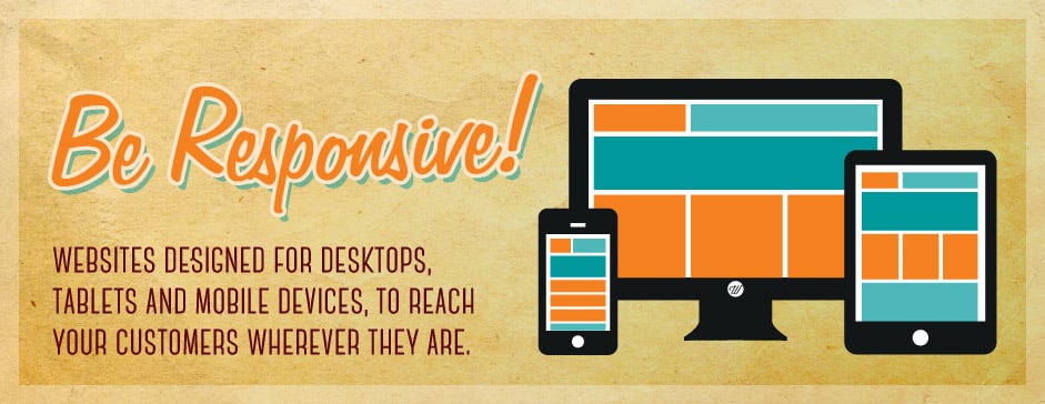
1. Adaptation to All Devices
This is one of the most beneficial aspects of Responsive Websites Designs that they provide lovely user-experience across many devices neglecting their screen sizes. Their flexibility to adapt the screen resolution of all devices makes it more appealing. You can imagine your site as effortlessly working for all devices that gives most firm positive user experience. The optimization of your site to all available screens size gives a remarkable universal look.
The working of a single website for both desktops & mobile device make it more extensive instead of different sites as per devices chooses by users. Can you imagine your site working independently & adjusting its self according to screens these may include rotation of screens, content reposition, images l resize, the font size shift and even navigations will change. These facilities build a positive image of your business site on end user that ultimately derived more audience.
2. Open Support For All Browsers
The Responsive Websites Designs are more compatible with all search engines. Which is the most important & beneficial feature of responsive websites. As we know Greater the compatibility of a website to search engines greater its visibility. Visibility features eventually provide the ease of accessibly acquired websites on all devices. These visibilities will attract more traffic to your site that raises your income graph.
Most popular search engines, Google Love Responsive Sites. It also recommends mobile optimized sites for target mobile users.
3. Perfection in Your SEO
The websites that don’t have responsive design are usually not compatible for smart phones and all other devices. For such devices the companies have to build ‘mobile sites’. These things not only double the work of developers, but also create a challenge for SEO persons to optimize the links of both mobile & desktop sites. Responsive designs of the website give easier for SEO’s persons to work only once & limited the burden of work.
These features provide the ease of optimizes the site against one link. One URL optimizations are very easy that give consistency in URL structure against all devices. This will eventually outcome higher performance rate of your website that make it more popular among the rest of the search results.
4. Low Cost & Higher Maintenance
It is the most important feature of RWD Websites, Games Apps for budget conscious customers. Instead of developing different versions of a single site that will compatible against desktop, laptop, iPods and smart phones you just need to develop a single site with responsive characteristics.
This will eventually minimize the cost factor and give ease of maintenance. In long term flawless flow of your website makes it resistant of unseen defects. It will lower the burden of maintenance in a cost effective manner.
5. More Sale & Higher Conversation
A huge number of visitors or people come to your site through smart phones, tablet and iPods. According to a survey this mobile revolution now optimistically 1.9 billion people are using smart phones in 2013. Now beings an owner of a business, you couldn’t ignore such number of majority visitors.
If you have an online business of selling goods and services than this responsive designs will raise your conversation. During the search of the user if your site will behave just like their preference than this will let them to stay on your site. The user friendly behavior of your site will lead to higher conversation rates.
Conclusion
In 21st century everyone have smart phones, tablets and other devices. With the advancement in technologies whole world is getting changed as a small village. By adapting this technological advancement in IT field you should build your business websites in responsive designs manners. Because of the importance of RWD from a business point of view, everyone should add this Responsive Design to their web strategies in future for the sake of batter visuality experience to mobile users. This ease of accessibility from any device catches more traffic to your site.
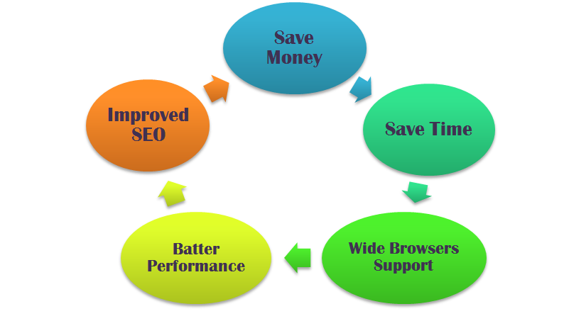
Responsive design of your site will improve user-experience, improve SEO burden and will provide high performance in low cost and less timings. These are the key point of flourishing your business as per user preference. For these reasons RWD is the best option for your exclusive business identity.


 Saudi Arabia (English)
 United Kingdom
 Global Site