9 Steps To Design A Logo 10 Times Better Than Before
- Technology Blog October 26,2017

Do you find Design A Logo difficult task? Think again… what if I’ll say yes, I’m agreeing with point to take difficulty with a sense of its importance. To the general public logos serve as instant reminders for companies or products. A logo is a company’s or brands 1st impression on its clients. So it’s very worthy it can build or destroy a clients or customers’ attitude towards products.
Design A Logo importance can be measured by the fact that it will be a point recognition for their brands, therefore each designer have presented with the challenge to incorporate the clients ideology into a single graphic logo. We are living in a society, painted with brands & logos. Even a simple layman can recognize the company’s nature of work by looking its brand mark.
Now I’m going to discuss each Design A Logo killer tips one by one in detail. That will ultimately provide you a new edge in your creative skills. By these tips you’ll not only become flourish designer, but also became capable of creating eye catching logos as well.
Do You Know How To Design A Logo? Learn From These Simple Tips
1. Be Focused & Simple
In this very 1st point I’ll describe the basic principles of pre-design logo tips. Before creating anything, just think about the aging & again, what do you want to build? What do your clients/customers wants? Have you got their points? All of these are brainstorming questions through which you have to go. All of these questions answered should be very clear in your mind before you go anything practical.
Don’t need to make things complex. You should keep things as simple as possible that will ultimately help you & your work. A simple logo design will lead you towards easy recognition of your desired company/brand. The simplicity in logos design provides ease of remembering. From these logos we can conclude that most simply designed are most popular for example ‘Apple’ & ‘Bulls Eyes’.

2. Be Original
Originality or uniqueness is the key feature for the design of a logo. You should understand that originality is the only key that will make your clients satisfied from your work & bring more profits in your accounts. You should create something out-of-box in order to make your own identity by coming with something new and generous.
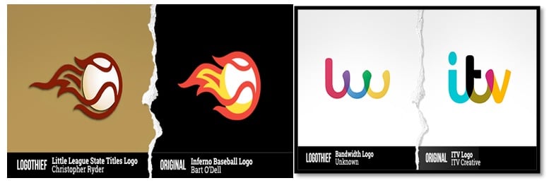
Your Design A Logo should be distinguishing in brands identity from its competitors. So your image should capable of stand out alone from rest. You can be inspired by some other brand logo, but it doesn’t mean your logo will be a copy paste or slight change from that original one. Designer that isn’t able to produce uniqueness elements in their work, or use to change others logo by computer tools can be caught by plagiarism sites like www.logothief.com
3. Understand Nature of Brand
Every Brand has its Personality. Being a designer you should aware of the importance of the brand. Design A Logo is not just an image it’s an introduction of a brand to its people. Logo use to represent the brand’s nature. So now its designer’s responsibility to not only creates a unique, loveable logo that will suit to the brand’s requirements as well. Before making your designed logos as final touch & representing to the customers, ponder about some brand related questions. These are
- Does it matched with customer/clients ideology?
- Is your work is original?
- What is the nature of brand?
- Is it utility driven/contemporary/offbeat etc?
Here is an example of Red Bull energy drink logo. From the logo you can easily understand the nature of the product. Yellow spot is displaying the sign of sun while these two bulls are depicting the strength aspects.
Be sure about your work is as the interests of clients defined for you, these points will ultimately add new happy customer in your customers links. These are positive aspects in your popularity as we knew it very well that a happy customer is the key to success.
4.Choose Best Colors
Your logo Design Scathing is nothing until you add beautiful colored patterns that exactly matched with the brand theme. As a designer, you’ll pretty sure about the most suitable color patterns for themes with respect to the backgrounds or brand names. So I am not going to discuss about the color choices. Here I’ll just want to share a breakdown to show the different modes related to each color. As we know, every color has its own specific implications:
- Red: energetic, sexy, bold
- Black: credible and powerful
- Orange: creative, friendly, youthful
- Yellow: sunny, creative, optimism
- Green: growth, natural, instructional
- Blue: professional, medical, calm, trustworthy
- Purple: spiritual, wise, evocative
- White: simple, clean, pure
- Pink: fun and flirty
- Brown: rural, historical, steady

5. Choose Best Suitable Fonts Sizes
For the Design A Logo that represent the brand’s name fonts matters a lot. Beings as creative designer you don’t need to be reinventing the wheel. By following this phrase we can start our work easily. It would be a great deal if we move from ordinary to extraordinary having sulphide’s attitude. Usually logos consist of word mark & a symbol. Some companies use symbols that are actually in favors for you guys (like Apple, Android, and Mercedes) others want to stick to Logotype entirely (like IBM, Coca Cola). While some go for both like Pepsi, Walt Disney etc.
I’ll prefer to, you do something exploring. Be aware of using thin, dainty & fragile font sizes. Your logo can be looked badly in small font sizes. Try different fonts available and come up new inventions that show your attitude towards works. Keep an eye to the little details that will eventually lead towards success.
6.Keep Things Simple & Flexible
The most important point for me is to keep things simple not for you, but for others as well. We cannot consider a person as uncreative if he or she goes for simplicity factor. We’ll try to boost your morale by altering it as: “keep things simple & stupid”. With this stupidity factor we can make things beyond expectations

Always think how can you go extra mile, by this attitude you can change boring logos into distinctive brand marks. Good examples are FedEx, Amazon & Adidas. Look at the Design A Logo of Adidas. According to the changes in the world with respect to social media they have changed their logo differently by keeping that parallel line with it every time.
7.Don’t Be Afraid of Spare Spaces
Yeah, it’s true that some designers got afraid of spare spaces. If you are too afraid of these things then you shouldn’t be now. You should learn how to utilize the negative spaces because you have the power to make it worthwhile. For this learning point I’ll suggest you to look at the FedEx logo Design. Did you find an arrow sign? No…. look again yes, it’s there between E and X. This is the most amazing & creative thing love about this Design A Logo.
8.Don’t Expect Fame Instantly
No matter from which profession you belong. You shouldn’t expect fame or success over night. It takes huge patience & struggles of years. Especially for designers, no matter how beautiful is your work, you can’t expect fame instantly because the fame of your logos actually dependent on product/brand’s popularity.
It would be better for you, don’t panic such situations. And in results don’t make changes in your designs. Awfully logos won’t become iconic, instantly no matter how efficiently you have used the combinations of vectors. Don’t change your Design A Logo because you are tired of it. Ups & downs are the part of life. Be stand even if you have to stand alone. Stay strong and believe yourself.
9.Utilize Online Tools & Resources
E–Learning has made a vast sea of knowledge. The whole world got changed as a small village. No matter where you are & where you from, you can learn anything you want to learn. As a designer you can learn online even if you are layman you can design your own logos. There are a number of websites that guide online to design your desired logos. For example
From these sites you can not only create your desired logos you can also buy them off-shelf available designs. There are lots of other online tools by using those you can learn about how to create beautiful logos. Nobody is born perfect, just start with basic eventually you will be succeeded.


 Saudi Arabia (English)
 United Kingdom
 Global Site