Difference Between Mobile Website and Responsive Website
- Mobile Apps October 22,2023
In today world of technology, every business owner knows the importance of grabbing the attention of potential customers with the help of a Mobile Website or other online tools of technology because they know it very well that without these tools they may go invisible for their clients and this invisibility could hit their market value.
Now the customers want to access the services through their Desktop, tablet or mobile phone so they need your presence on all available devices. It could be hard for many people to differentiate between the separate mobile website or responsive website design, and could also be difficult to choose between them for some specific business.
There is a lot of difference between these two tools that need to be clear before taking the final decision. So today we’ll focus on the difference between Mobile Website and Responsive website.

Mobile Website
A mobile website is a separate version of the desktop website that is designed especially for smartphone devices. You might have seen the mobile-optimized website version in years ago.
Around almost 10 years ago there was a trend of creating two versions of the website, one is desktop or others is a mobile version. If a smartphone user visits such sites they are automatically detected about the mobile version of the website. These mobile-optimized websites were very beneficent in different ways:
- These websites lead towards the good user experience because the mobile optimized websites could be accessed easily all content could be seen or read easily.
- Mobile optimized websites increase the downloading and loading speed.
- Such websites improve the search ranking on different search engines.
- They could be accessed anywhere and anytime, this connectivity will increase the consumer’s confidence and trust.
- It is a cost-effective technique to available for users and to stand out among the competitors.
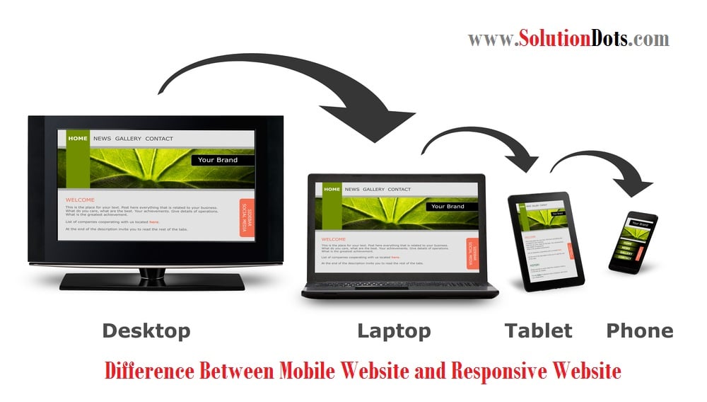
Responsive Website Design
Responsive website design refers to creating a website that functions seamlessly across desktops, tablets, and mobile devices, delivering the same content. It automatically modifies the layout to fit various screen sizes for optimal viewing.
Responsive website design is a smart, forward-thinking approach that adapts seamlessly to various devices. It optimizes screen layouts using a simple formula of one, two, or three columns for user-friendly experiences.The content is displayed on the desktop is displayed in three columns, while in the tablet it is adjusted in two column and one column is displayed in mobile. The business owners are preferring responsive website design and appreciates its benefits such as:
- A responsive website enhances user-friendliness, improving Google ranking and showcasing your business’s commitment to user needs.
- A higher Google ranking attracts more potential customers, boosting sales and revenue by offering easy access to your business information.
- Responsive website design will improve the user’s experience because they could easily get the information anywhere and anytime.
- Responsive website design saves time for both website management and users, enhancing efficiency.
- You only need to update and monitor one website to access consolidated reports on user journeys.
To Conclude:
Responsive website design is a mobile-friendly, efficient, and time-saving solution that’s easy to maintain. Unlike mobile-optimized sites, which require dual content for desktop and mobile, responsive design adapts automatically. Though more costly, it offers greater efficiency. Each approach has pros and cons, depending on the business owner’s preference.


 Saudi Arabia (English)
 United Kingdom
 Global Site